Composite Editor Modal
index
Composite Editor Modal Window Actions/Types
Mass Selection (similar to Mass Update but apply changes only to selected rows)
Callback Functions
onBeforeOpen - allows the user to optionally execute something before opening the modal
onClose - allows to warn/confirm with the user when leaving the form with unsaved data
onError - allows you to customize what to do when the modal throws an error (show an alert or toast notification)
onSave - typically used with a Backend Service API
Dynamic Events/Methods
Dynamically Change a Form Input - for example when 1 input value affect 1 or more other input(s).
Dynamically Change
options- for example, date pickerminDatebased on other field values
Demo
Description
The Composite Editor Modal allows you to (create, clone, edit, mass update & mass selection changes). I believe the SlickGrid author names it as Composite Editor because it loops through each editor of all the column definitions and displays them in one composed form, hence the name Composite Editors. Also note that each editor are pulled directly from the column definition itself (their column title as well), so for example if you use Editors.longText then you will have a text area input associated to that field with the appropriate input label.
The following 5 modal types (6 if we include the auto-mass) are available (via CompositeEditorModalType interface):
create- create a new row/itemclone- clone allows to copy & possibly edit some inputs before cloningedit- edit a row/itemmass-update- apply changes on the entire datasetmass-selection- apply changes on all the selected row (similar to mass update but only on the selection)auto-mass- will auto-detect if it should do a Mass Update (no row selected) or a Mass Selection Changes (with rows selected)most user find this one approach confusing, our users prefer to have 2 separate buttons (which is a lot less confusing)
Create New Item
You can Create a new row/item via the composite editor modal window, it will display all editors as blank input field. Also note that this feature requires the enableAddRow grid option to be enabled or else it will throw an error.
Note: the new item will be added to the top of the grid by default, if you wish to change that you can use insertOptions. The options are the same as calling addItem() from the Grid Service, so if you wish to add the new item to the bottom then you use this insertOptions: { position: 'bottom' }
with TypeScript
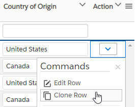
Clone Item
You can Clone an existing row/item via the composite editor modal window (basically allows you to copy a row but also to make edits before cloning it). The setup is nearly identical to the Create Item, just make sure to display appropriate modal title. Also note that this feature requires the enableAddRow grid option to be enabled or else it will throw an error.
Refer to the Create Item section for code sample
Just a side note on the UI, a good way to use this composite editor feature is probably with a Cell Menu (aka Action Menu)
Edit Item
You can Edit an existing row/item via the composite editor modal window. The setup is nearly identical to the Create Item, just make sure to display appropriate modal title.
Refer to the Create Item section for code sample
Similar to the Clone Item, a good way to use this composite editor feature is probably with a Cell Menu (aka Action Menu)
Mass Update
Mass Update allows you to apply changes (from the modal form) to the entire dataset, internally it will apply the changes to all the items in the grid via the DataView. However, you could also choose to refresh the grid yourself after calling the backend and if you choose to do that then you'll want to do that via the onSave async callback (once backend is done, refresh the grid).
Note however that there is a subtle difference compare to the Create Item action, you need to specifically tag which column will show up in the Mass Update and you need to do that by adding massUpdate: true flag inside the editor property of each column definition that you wish to be included in the form.
auto-mass option: If you decide to use Mass Update and Mass Selection and wish to only expose 1 button to do the action and let the system decide if it's doing a Mass Update or a Mass Selection change, you can use the modal type auto-mass (if it detect that some rows are selected it will use Mass Selection or else Mass Update). From our experience, user prefer to expose the 2 separate action buttons (less confusion), but this for you to decide, you have the option.
with TypeScript
Mass Selection
Similar to the Mass Update but apply changes only on the selected rows. The setup is nearly identical to the Mass Update, just make sure to display appropriate modal title. Also note that you also need to add massUpdate: true flag inside the editor property of each column definition that you wish to be included in the Mass Selection changes form.
Refer to the Mass Update section for code sample.
auto-mass option: If you decide to use Mass Update and Mass Selection and wish to only expose 1 button to do the action and let the system decide if it's doing a Mass Update or a Mass Selection change, you can use the modal type auto-mass (if it detect that some rows are selected it will use Mass Selection or else Mass Update). From our experience, user prefer to expose the 2 separate action buttons (less confusion), but this for you to decide, you have the option.
Callback Functions
onBeforeOpen
The onBeforeOpen callback function allows the user to optionally execute something before opening the modal. This is synchronous call and it won't wait until proceeding to opening the modal, it just allows you to possibly do something before opening the modal (for example cancel any batch edits, or change/reset some validations in column definitions).
onClose
The onClose callback function allows you to show a warning or confirm dialog to the user if there's any form input that were left unsaved. For example, when the user opens the modal window and start changing a few inputs in the form but then decides to the form, this is when the onClose gets executed (and to be clear, it only gets executed when there's changes in the form and a close action is clicked, it won't execute when there's no changes).
You can return a synchronous or asynchronous function (typically the latter), for example we could display an alert when leaving with unsaved data.
onDispose
The onDispose callback function notifies you that the editor is finished and being disposed. It gets called regardless of whether there are changes or not.
onError
The onError callback function will execute anytime an error is thrown by the modal window. You can return a synchronous or asynchronous function (typically the latter), for example we could display an alert when leaving with unsaved data.
The onError error follows the OnErrorOption which includes the interface shown below (and if you want to customize the text or use translation, you will want to use the code)
The available error code are the following:
EDITABLE_GRID_REQUIRED: with default text of"Your grid must be editable in order to use the Composite Editor Modal."ENABLE_ADD_ROW_REQUIRED: with default text of"Composite Editor requires the flag "enableAddRow" to be set to True in your Grid Options when cloning/creating a new item."ENABLE_CELL_NAVIGATION_REQUIRED: with default text of"Composite Editor requires the flag "enableCellNavigation" to be set to True in your Grid Options."ITEM_ALREADY_EXIST: with default text of"The item object which you are trying to add already exist with the same Id:: ${newId}"NO_CHANGES_DETECTED: with default text of"Sorry we could not detect any changes."NO_EDITOR_FOUND: with default text of"We could not find any Editor in your Column Definition"NO_RECORD_FOUND: with default text of"No records selected for edit or clone operation."ROW_NOT_EDITABLE: with default text of"Current row is not editable."ROW_SELECTION_REQUIRED: with default text of"You must select some rows before trying to apply new value(s)."
onSave
The onSave callback function is optional and is very useful whenever you have a backend API (which I assume is most of the time). This callback will provide you with 3 arguments (formValues, selection, dataContext)
formValues: all the input values changed in the modal window formselection: selected rows (commonly used with Mass Update/Mass Selection)dataContext: item data context object (commonly used with Create/Clone/Edit)
Note: the onSave must return a boolean or a Promise<boolean> and if the returned result is true it will apply the changes to the data in the grid. However if it returns false then it assumes that an error occurred and no changes be applied in the grid.
You can return a synchronous or asynchronous function (typically the latter), we can take the example below when creating an item
Create Item demo
Mass Selection changes demo
Note that the formValues is an object with a very simple structure, the object properties are the column id with their new values. For example if we changed the column id of percentCompleted with a value of 100% and we also changed another column id isCompleted to true, then our formValues will be:
const formValues = { percentCompleted: 100, isCompleted: true };
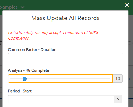
onSave validation error/rejection
When adding a backend API to the onSave you can (and should) wrap your code in a try/catch and use the Promise rejection to send it back to the modal. If the modal finds any errors when saving, it will keep the modal window open and display the error as a validation summary on top of the modal as shown below (as you can see below the backend rejected the save because the value is below 50%)
How to Skip a Mass Change
Mass Change (Mass-Update / Mass-Selection) - Skipping according to certain condition(s)
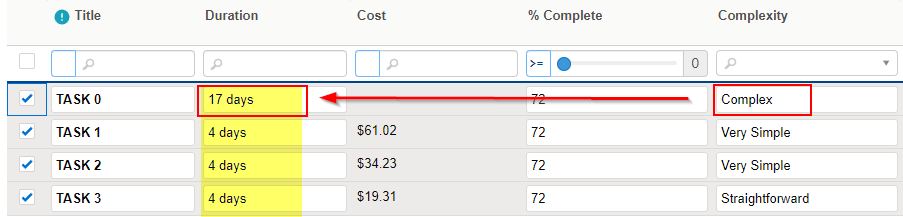
The use case would be to skip a change, in silent without any errors shown, if another column or property has value(s) that do not match our condition expectaation. A possible use case could be found under Example 12, the use case that we could do is the following: "Do not apply a mass change on the 'Duration' column that is below 5 days if its 'Complexity' column is set to 'Complex' or 'Very Complex'", the code do this use case is shown below. Also note that the 3rd argument of onSave (in our case dataContextOrUpdatedDatasetPreview) will have the updated dataset but without the change(s) that got skipped
With that same use case, let say that we try changing the first 4 rows with a "Duration" of 4 days, it will apply the changes to all the rows except the first row where the change is skipped because its complexity is set to "Complex" and we don't want a duration to be below 5 days for our use case.
Form Input Order Index
When using Composite Editor Modal, the inputs will show up with the order that they were entered in the column definitions array. You can use compositeEditorFormOrder editor option to provide a specific order to show these inputs in the form.
Customize Text Labels
You can customize many of the text labels used in the modal window, they are all regrouped under the labels options
Regular text labels (without translations)
cancelButton: defaults to"Cancel", override the Cancel button labelcloneButton: defaults to"Clone", override the Clone button label used by a modal type of "clone"massSelectionButton: defaults to"Update Selection", override the Mass Selection button labelmassSelectionStatus: defaults to"{{selectedRowCount}} of {{totalItems}} selected", override the Mass Selection status text on the footer left sidemassUpdateButton: defaults to"Mass Update", override the Mass Update button labelmassUpdateStatus: defaults to"all {{totalItems}} items", override the Mass Update status text on the footer left sidesaveButton: defaults to"Save", override the Save button label used by a modal type of "create" or "edit"
with a Translation Service (I18N)
As all other features using translation in this library, you can provide a translation key with the Key suffix and the available keys are the following
cancelButtonKey: defaults to"CANCEL", translation key used for the Cancel button label.cloneButtonKey: defaults to"CLONE", translation key used for the Clone button label used by a modal type of "clone"massSelectionButtonKey: defaults to"APPLY_TO_SELECTION", translation key used for the Mass Selection button label.massSelectionStatusKey: defaults to"X_OF_Y_MASS_SELECTED", translation key used for the Mass Selection status text on the footer left sidemassUpdateButtonKey: defaults to"APPLY_MASS_UPDATE", translation key used for the Mass Update button label.massUpdateStatusKey: defaults to"ALL_X_RECORDS_SELECTED", translation key used for the Mass Update status text on the footer left sidesaveButtonKey: defaults to"SAVE", translation key used for the Save button label used by a modal type of "create" or "edit"
For example
UI Options & Responsive Design
There are multiple options that you can change to change the UI design a bit, here's a lit of things you can change with their defaults
backdrop: allows you add/remove the modal backdrop (options are'static' | null, default isstatic)showCloseButtonOutside: boolean value to show the close (icon) button inside or outside the modal window (defaults totrue)note that the modal has some minimal responsive design styling and will automatically show the close icon inside the modal when available space is small
viewColumnLayout: how many columns do we want to show in the view layout (options are1 | 2 | 3 | 'auto', defaults toauto)for example if you wish to see your form split in a 2 columns layout (split view) then use
2the
automode will display a 1 column layout for 8 or less Editors, 2 columns layout for less than 15 Editors or 3 columns when more than 15 Editors
Dynamic Methods
Dynamically Change Form Input
View
ViewModel
Dynamically Change Editor Options (like minDate on a date picker)
minDate on a date picker)For example, say that you have a Date1 and that when the user changes the Date1 to let say "2020-02-02" and you wish to use this new date as the minDate of the Date2, you can do it via the changeFormEditorOption() method as shown below.
The example below shows code sample for all 3 supported editors AutoComplete, Date (picker), Single/Multiple Select (dropdown)
View
ViewModel
Dynamically Update Select Editor Collection
What if you need to change the collection array of a single/multiple select editor but based on another field input in the form?
There are 2 ways to do it
When you use
collectionOverride(this will work in both the grid and the modal window)the important thing to know is that the
collectionOverridedefined in the column definition below will returnfinalCollectionand that is what we refer to aseditor.finalCollectioninside thehandleOnCompositeEditorChangeevent handler
View
ViewModel
When you simply want to replace the entire collection (this will NOT work in the grid, this will only work in the modal window)
this is not recommended unless you only care about what happens in the modal window and not in the grid (editing), so option (1) with
collectionOverrideis preferable
Disabling Form Inputs (readonly)
Disabling field(s) is done through the exact same way that you would do it in the grid, which is through the onBeforeEditCell SlickGrid event and you can find more in depth info at this other Wiki - Disabling specific cell edit
Disabling Form Inputs but only in Composite Editor
What if you want to disable certain form inputs but only in the Composite Editor, or use different logic in the grid. For that we added an extra target (target will return either "grid" or "composite") in the returned args, so you could apply different logic based on the target being the grid or the composite editor. For example:
Last updated