📕
Angular-Slickgrid
Live DemoGitHub
  • Introduction
  • Getting Started
    • Quick start
    • Troubleshooting
  • Styling
    • Dark Mode
    • Styling CSS/SASS/Themes
  • Column Functionalities
    • Cell Menu (Action Menu)
    • Editors
      • Autocomplete
      • Date Picker (vanilla-calendar)
      • LongText (textarea)
      • Select Dropdown Editor (single/multiple)
    • Filters
      • Autocomplete
      • Input Filter (default)
      • Select Filter (dropdown)
      • Compound Filters
      • Range Filters
      • Custom Filter
      • Styling Filled Filters
      • Single Search Filter
    • Formatters
    • Sorting
  • Events
    • Available events
    • On Events
  • Slick Grid/DataView Objects
    • Slick Grid/DataView Objects
  • Grid Functionalities
    • Auto-Resize / Resizer Service
    • Resize by Cell Content
    • Column Picker
    • Composite Editor Modal
    • Custom Tooltip
    • Add, Update or Highlight a Datagrid Item
    • Dynamically Add CSS Classes to Item Rows
    • Column & Row Spanning
    • Context Menu
    • Custom Footer
    • Excel Copy Buffer Plugin
    • Export to Excel
    • Export to File (csv/txt)
    • Grid Menu
    • Grid State & Presets
    • Grouping & Aggregators
    • Header & Footer Slots
    • Header Menu & Header Buttons
    • Infinite Scroll
    • Pinning (frozen) of Columns/Rows
    • Providing data to the grid
    • Row Detail
    • Row Selection
    • Tree Data Grid
    • Row Based Editing Plugin
    • FAQ
  • Developer Guides
    • CSP Compliance
  • Localization
    • with Custom Locales
    • with ngx-translate
      • Component Sample
  • Backend Services
    • Custom Backend Service
    • OData
    • GraphQL
      • JSON Result Structure
      • Filtering Schema
      • Pagination Schema
      • Sorting Schema
  • Testing
    • Testing Patterns
  • Migrations
    • Migration Guide to 2.x (2018-06-23)
    • Migration Guide to 3.x (2021-07-20)
    • Migration Guide to 4.x (2021-12-11)
    • Migration Guide to 5.x (2022-10-17)
    • Migration Guide to 6.x (2023-05-29)
    • Migration Guide to 7.x (2023-12-15)
    • Migration Guide to 8.x (2024-05-23)
    • Migration Guide to 9.x (2025-05-10)
Powered by GitBook
On this page
Edit on GitHub
  1. Column Functionalities
  2. Filters

Autocomplete

PreviousFiltersNextInput Filter (default)

Last updated 7 days ago

Index

Demo

|

Introduction

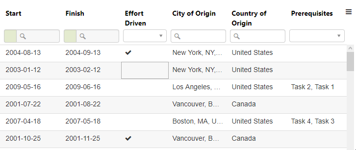
AutoComplete is a functionality that let the user start typing characters and the autocomplete will try to give suggestions according to the characters entered. The collection can be a JSON files (collection of strings or objects) or can also be an external resource like a JSONP query to an external API. For a demo of what that could look like, take a look at the below.

We use an external lib named (aka autocompleter on npm) by Kraaden.

Using collection or collectionAsync

If you want to pass the entire list to the AutoComplete (like a JSON file or a Web API call), you can do so using the collection or the collectionAsync (the latter will load it asynchronously). You can also see that the Editor and Filter have almost the exact same configuration (apart from the model that is obviously different).

<angular-slickgrid gridId="grid2"
     [columns]="columnDefinitions"
     [options]="gridOptions"
     [dataset]="dataset">
</angular-slickgrid>

Component

import { Component, OnInit} from '@angular/core';

export class GridBasicComponent implements OnInit {
  columnDefinitions: Column[];
  gridOptions: GridOption;
  dataset: any[];

  ngOnInit(): void {
      // your columns definition
    this.columnDefinitions = [
      {
        id: 'countryOfOrigin', name: 'Country of Origin', field: 'countryOfOrigin',
        formatter: Formatters.complexObject,
        dataKey: 'code', // our list of objects has the structure { code: 'CA', name: 'Canada' }, since we want to use the code`, we will set the dataKey to "code"
        labelKey: 'name', // while the displayed value is "name"
        type: 'object',
        sorter: Sorters.objectString, // since we have set dataKey to "code" our output type will be a string, and so we can use this objectString, this sorter always requires the dataKey
        filterable: true,
        sortable: true,
        minWidth: 100,
        editor: {
          model: Editors.autocompleter,
          customStructure: { label: 'name', value: 'code' },
          collectionAsync: this.http.get('assets/data/countries.json'), // this demo will load the JSON file asynchronously
        },
        filter: {
          model: Filters.autocompleter,
          customStructure: { label: 'name', value: 'code' },
          collectionAsync: this.http.get('assets/data/countries.json'),
        }
      }
    ];

    this.gridOptions = {
      // your grid options config
    }
  }
}

Filter Options (AutocompleterOption interface)

filter: {
  model: Filters.autocompleter,
  // previously known as `filterOptions` for < 9.0
  options: {
    minLength: 3,
  } as AutocompleterOption
}

Using External Remote API

You could also use external 3rd party Web API (can be JSONP query or regular JSON). This will make a much shorter result since it will only return a small subset of what will be displayed in the AutoComplete Editor or Filter. For example, we could use GeoBytes which provide a JSONP Query API for the cities of the world, you can imagine the entire list of cities would be way too big to download locally, so this is why we use such API.

Note

I don't have time to invest in finding how to use JSONP + CORS in Angular, if someone wants to submit a PR (Pull Request) with the proper Angular code, I would be happy to merge the code and update the Wiki. For now, I'll simply make a quick and easy example with the jQuery $.ajax call just for you to get the idea of how it works.

<angular-slickgrid gridId="grid2"
     [columns]="columnDefinitions"
     [options]="gridOptions"
     [dataset]="dataset">
</angular-slickgrid>

Component

import { Component, OnInit} from '@angular/core';

export class GridBasicComponent implements OnInit {
  columnDefinitions: Column[];
  gridOptions: GridOption;
  dataset: any[];

  ngOnInit(): void {
      // your columns definition
    this.columnDefinitions = [
      {
        id: 'cityOfOrigin', name: 'City of Origin', field: 'cityOfOrigin',
        filterable: true,
        minWidth: 100,
        editor: {
          model: Editors.autocompleter,
          placeholder: 'search city', //  you can provide an optional placeholder to help your users

          // use your own autocomplete options, instead of $.ajax, use http
          // here we use $.ajax just because I'm not sure how to configure http with JSONP and CORS
          // previously known as `filterOptions` for < 9.0
          options: {
            minLength: 3, // minimum count of character that the user needs to type before it queries to the remote
            fetch: (searchText, updateCallback) => {
              // assuming your API call returns a label/value pair
              yourAsyncApiCall(searchText) // typically you'll want to return no more than 10 results
                 .then(result => updateCallback((results.length > 0) ? results : [{ label: 'No match found.', value: '' }]))
                 .catch(error => console.log('Error:', error));
            }
          },
        },
        filter: {
          model: Filters.autocompleter,
          // placeholder: '&#128269; search city', // &#128269; is a search icon, this provide an option placeholder

          // use your own autocomplete options, instead of $.ajax, use http
          // here we use $.ajax just because I'm not sure how to configure http with JSONP and CORS
          options: {
            minLength: 3, // minimum count of character that the user needs to type before it queries to the remote
            fetch: (searchText, updateCallback) => {
              // assuming your API call returns a label/value pair
              yourAsyncApiCall(searchText) // typically you'll want to return no more than 10 results
                 .then(result => updateCallback((results.length > 0) ? results : [{ label: 'No match found.', value: '' }]))
                 .catch(error => console.log('Error:', error));
            },
          }
        }
      }
    ];

    this.gridOptions = {
      // your grid options config
    }
  }
}

Autocomplete - force user input

Requires version 2.6.0+

If you want to add the autocomplete functionality but want the user to be able to input a new option, then follow the example below:

  this.columnDefinitions = [{
        id: 'area',
        name: 'Area',
        field: 'area',
        editor: {
          model: Editors.autocompleter,
          // previously known as `filterOptions` for < 9.0
          options: {
            minLength: 0,
            forceUserInput: true,
            fetch: (searchText, updateCallback) => {
              updateCallback(this.areas); // add here the array
            },
          }
        }
      },
  ];

You can also use the minLength to limit the autocomplete text to 0 characters or more, the default number is 3.

Animated Gif Demo

All the available options that can be provided as filter options to your column definitions can be found under this and you should cast your filter options to that interface to make sure that you use only valid options of the autocomplete library.

AutocompleterOption interface
Demo Page
Demo Component
Autocomplete
Using collection or collectionAsync
Filter Options (AutocompleterOption interface)
Using Remote API
Force User Input
Animated Gif Demo
animated gif demo
Update Filters Dynamically