📘
Slickgrid-React
Live DemoGitHub
  • Introduction
  • Getting Started
    • Quick start
  • Styling
    • Dark Mode
    • Styling CSS/SASS/Themes
  • Column Functionalities
    • Cell Menu (Action Menu)
    • Editors
      • Autocomplete
      • new Date Picker (vanilla-calendar)
      • LongText (textarea)
      • Select Dropdown Editor (single/multiple)
    • Filters
      • Autocomplete
      • Input Filter (default)
      • Select Filter (dropdown)
      • Compound Filters
      • Range Filters
      • Custom Filter
      • Styling Filled Filters
      • Single Search Filter
    • Formatters
    • Sorting
  • Events
    • Available events
    • On Events
  • Slick Grid/DataView Objects
    • Slick Grid/DataView Objects
  • Grid Functionalities
    • Auto-Resize / Resizer Service
    • Resize by Cell Content
    • Column Picker
    • Composite Editor Modal
    • Custom Tooltip
    • Add, Update or Highlight a Datagrid Item
    • Dynamically Add CSS Classes to Item Rows
    • Column & Row Spanning
    • Context Menu
    • Custom Footer
    • Excel Copy Buffer Plugin
    • Export to Excel
    • Export to File (csv/txt)
    • Grid Menu
    • Grid State & Presets
    • Grouping & Aggregators
    • Header & Footer Slots
    • Header Menu & Header Buttons
    • Infinite Scroll
    • Pinning (frozen) of Columns/Rows
    • Providing data to the grid
    • Row Detail
    • Row Selection
    • Tree Data Grid
    • Row Based Editing Plugin
  • Developer Guides
    • CSP Compliance
  • Localization
    • with I18N
    • with Custom Locales
  • Backend Services
    • Custom Backend Service
    • OData
    • GraphQL
      • JSON Result Structure
      • Filtering Schema
      • Pagination Schema
      • Sorting Schema
  • Testing
    • Testing Patterns
  • Migrations
    • Migration Guide to 3.x (2023-05-29)
    • Migration Guide to 4.x (2023-12-15)
    • Migration Guide to 5.x (2024-05-10)
    • Versions 6 to 8 are skipped...
    • Migration Guide to 9.x (2025-05-10)
Powered by GitBook
On this page
Edit on GitHub
  1. Grid Functionalities

Export to Excel

PreviousExcel Copy Buffer PluginNextExport to File (csv/txt)

Last updated 3 days ago

index

Description

You can Export to Excel, it will create an Excel file with the .xlsx default extension (you can also change it to be .xls). If you wish to export to CSV or other delimiter like Tab Delimited, you can refer to the other .

NOTE: this is an opt-in Service, you must download the necessary Service from @slickgrid-universal/excel-export and instantiate it in your grid options via externalResources, see multiple examples below.

Demo

/

CSP (Content Security Policy)

Since we use the library Excel-Builder-Vanilla, which itself uses fflate as a dependency, that library uses Web Worker when it can which might throw a CSP error.

The easiest way to fix this problem is to modify your CSP header by adding the rule worker-src 'self' blob:;

<meta http-equiv="Content-Security-Policy"
  content="default-src 'self'; ...other rules...  worker-src 'self' blob:;" />

Grid Menu (hamburger menu)

The Grid Menu already has the "Export to Excel" enabled by default, so you will see it automatically in your Grid Menu. You still have the options to show/hide from the Grid Menu if you wish

  • hideExportExcelCommand false by default, so it's optional

Grid Options

You can set certain options for the entire grid, for example if you set exportWithFormatter it will evaluate the Formatter (when exist) output to export each cell. The Grid Menu also has the "Export to Excel" enabled by default.

import { ExcelExportService } from '@slickgrid-universal/excel-export';

const Example: React.FC = () => {
  const [dataset, setDataset] = useState<any[]>([]);
  const [columns, setColumns] = useState<Column[]>([]);
  const [options, setOptions] = useState<GridOption>();

  useEffect(() => defineGrid());

  function defineGrid() {
    const gridOptions = {
      enableExcelExport: true,
      // set at the grid option level, meaning all column will evaluate the Formatter (when it has a Formatter defined)
      excelExportOptions: {
        exportWithFormatter: true
      },
      externalResources: [new ExcelExportService()],
      gridMenu: {
        hideExportExcelCommand: false,        // false by default, so it's optional
      }
    };
  }
}

Column Definition and Options

Column Definition

  • excludeFromExport flag, which as it's name suggest will skip that column from the export

  • exportWithFormatter flag (same as Grid Options but this flag defined in the Column Definition has higher priority).

    • So basically, if exportWithFormatter is set to True in the excelExportOptions of the Grid Options, but is set to False in the Column Definition, then the result will be False and will not evaluate it's Formatter.

  • exportCustomFormatter will let you choose a different Formatter when exporting

    • For example, you might have formatter: Formatters.checkmark but you want to see a boolean translated value, in this case you would define an extra property of customFormatter: Formatters.translateBoolean.

  • set sanitizeDataExport to remove any HTML/Script code from being export. For example if your value is <span class="mdi mdi-check">True</span> will export True without any HTML (data is sanitized).

    • this flag can be used in the Grid Options (all columns) or in a Column Definition (per column).

Grid Options

  • addGroupIndentation flag, enabled by default will add indentation and collapsed/expanded symbols when using grouping feature

    • groupCollapsedSymbol will let you choose a different group collapsed symbol, it must be a unicode string (for example "\u25B9" or "\u25B7")

    • groupExpandedSymbol will let you choose a different group collapsed symbol, it must be a unicode string (for example "\u25BF" or "\u25BD")

  • exportWithFormatter flag (same as Grid Options but this flag defined in the Column Definition has higher priority).

    • So basically, if exportWithFormatter is set to True in the excelExportOptions of the Grid Options, but is set to False in the Column Definition, then the result will be False and will not evaluate it's Formatter.

  • filename name of the Excel file export (without extension)

  • format file extension format .xls/.xlsx

  • sheetName allows you to change the Excel Sheet Name (defaults to "Sheet1")

  • groupingColumnHeaderTitle The column header title (at A0 in Excel) of the Group by. If nothing is provided it will use "Group By"

  • groupingAggregatorRowText The default text to display in 1st column of the File Export, which will identify that the current row is a Grouping Aggregator

  • set sanitizeDataExport to remove any HTML/Script code from being export. For example if your value is <span class="mdi mdi-check">True</span> will export True without any HTML (data is sanitized).

    • this flag can be used in the Grid Options (all columns) or in a Column Definition (per column).

  • customExcelHeader is a callback method that can be used to provide a custom Header Title to your Excel File

Behaviors

  • If you have a headerKey defined (for Translate (i18n)), it will use the translated value as the Header Title

import { ExcelExportService } from '@slickgrid-universal/excel-export';

const Example: React.FC = () => {
  const [dataset, setDataset] = useState<any[]>([]);
  const [columns, setColumns] = useState<Column[]>([]);
  const [options, setOptions] = useState<GridOption | undefined>(undefined);

  useEffect(() => defineGrid(), []);

  function defineGrid() {
    setColumns([
      { id: 'id', name: 'ID', field: 'id',
        excludeFromExport: true // skip the "id" column from the export
      },
      { id: 'title', name: 'Title', field: 'id', headerKey: 'TITLE',
        formatter: myCustomTitleFormatter,
        exportWithFormatter: false // this Formatter will not be evaluated
      },
      { id: 'start', name: 'Start', field: 'start',
        headerKey: 'START',
        formatter: Formatters.dateIso // this formatter will be used for the export
      },
      { id: 'finish', name: 'Finish', field: 'start',
        headerKey: 'FINISH',
        formatter: Formatters.dateIso // this formatter will be used for the export
      },
      { id: 'completed', name: 'Completed', field: 'completed', headerKey: 'COMPLETED',
        formatter: Formatters.checkmarkMaterial,              // will display a checkmark icon in the UI
        customFormatter: Formatters.translateBoolean, // will export a translated value, e.g. in French, True would show as 'Vrai'
      }
    ]);

    setOptions({
      // set at the grid option level, meaning all column will evaluate the Formatter (when it has a Formatter defined)
      excelExportOptions: {
        exportWithFormatter: true
      },
      externalResources: [new ExcelExportService()],
    });
  }
}

What we can see from the example, is that it will use all Formatters (when exist) on this grid, except for the last column "Completed" since that column has explicitly defined exportWithFormatter: false

Custom Column Width

You can define a custom Excel column width (the width Excel's own width which is not in pixel). You can define a custom width per column (in your column definitions) and/or for the entire grid (in your grid options).

Per Column

You could set a custom width per column

const columnDefinitions = [
  { id: 'firstName', name: 'FirstName', exportColumnWidth: 10, },
  // ...
];

For the entire Grid

You could also set a custom width for the entire grid export via the excelExportOptions

const gridOptions = {
  // set at the grid option level, meaning all column will evaluate the Formatter (when it has a Formatter defined)
  excelExportOptions: {
    customColumnWidth: 15,
  },
  externalResources: [new ExcelExportService()],
};

Styling the Header Titles

const gridOptions = {
  // set at the grid option level, meaning all column will evaluate the Formatter (when it has a Formatter defined)
  excelExportOptions: {
    // you can customize how the header titles will be styled (defaults to Bold)
    columnHeaderStyle: { font: { bold: true, italic: true } }
  },
  externalResources: [new ExcelExportService()],
};

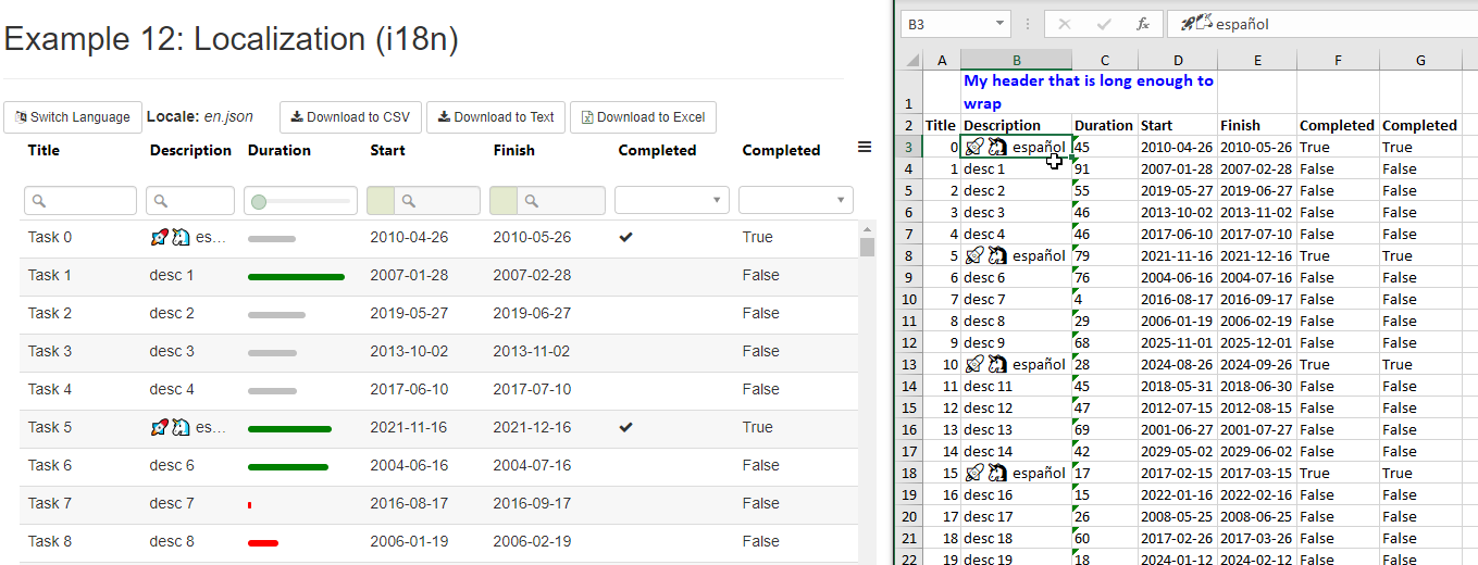
Provide a Custom Header Title

The example below shows a title which uses a merged cell from "B1" to "D1" with a red bold color (pay attention to the color code, you need to add an extra "FF" in front of an html color code).

Component

const Example: React.FC = () => {
  const [dataset, setDataset] = useState<any[]>([]);
  const [columns, setColumns] = useState<Column[]>([]);
  const [options, setOptions] = useState<GridOption | undefined>(undefined);
  const reactGridRef = useRef<SlickgridReactInstance | null>(null);

  useEffect(() => defineGrid());

  function reactGridReady(reactGrid: SlickgridReactInstance) {
    reactGridRef.current = reactGrid;
  }

  function defineGrid() {
    setColumns([]);
    setOptions({
      externalResources: [new ExcelExportService()],
      excelExportOptions: {
        // optionally pass a custom header to the Excel Sheet
        // a lot of the info can be found on Excel-Builder-Vanilla
        // https://ghiscoding.gitbook.io/excel-builder-vanilla/cookbook/fonts-and-colors
        customExcelHeader: (workbook, sheet) => {
          const customTitle = translate.currentLang === 'fr' ? 'Titre qui est suffisament long pour être coupé' : 'My header that is long enough to wrap';
          const stylesheet = workbook.getStyleSheet();
          const aFormatDefn = {
            'font': { 'size': 12, 'fontName': 'Calibri', 'bold': true, color: 'FF0000FF' }, // every color starts with FF, then regular HTML color
            'alignment': { 'wrapText': true }
          };
          const formatterId = stylesheet.createFormat(aFormatDefn);
          sheet.setRowInstructions(0, { height: 30 }); // change height of row 0

          // excel cells start with A1 which is upper left corner
          sheet.mergeCells('B1', 'D1');
          const cols = [];
          // push empty data on A1
          cols.push({ value: '' });
          // push data in B1 cell with metadata formatter
          cols.push({ value: customTitle, metadata: { style: formatterId.id } });
          sheet.data.push(cols);
        }
      },
    });
  }
}

Export from a Button Click Event

You can use the export from the Grid Menu and/or you can simply create your own buttons to export.

View

<button class="btn btn-default btn-sm" onClick={() => exportToExcel()}>
   Download to Excel
</button>

Component

The code below is just an example and it can be configured in many ways, see the excelExportOptions.

const Example: React.FC = () => {
  const [dataset, setDataset] = useState<any[]>([]);
  const [columns, setColumns] = useState<Column[]>([]);
  const [options, setOptions] = useState<GridOption | undefined>(undefined);
  const reactGridRef = useRef<SlickgridReactInstance | null>(null);
  const excelExportService = new ExcelExportService();

  function reactGridReady(reactGrid: SlickgridReactInstance) {
    reactGridRef.current = reactGrid;
  }

  function defineGrid() {
    setColumns([]);
    setOptions({
      enableExcelExport: true,
      externalResources: [excelExportService],
    });
  }

  function exportToFile() {
    excelExportService.exportToExcel({
      filename: 'myExport',
      format: 'xlsx'
    });
  }
}

Show Loading Process Spinner

Component

return !options ? null : (
  {processing && <span>
    <i className="mdi mdi-sync mdi-spin"></i>
  </span>}

  <SlickgridReact gridId="grid5"
      columns={columns}
      options={options}
      dataset={dataset}
      paginationOptions={paginationOptions}
      onReactGridCreated={$event => reactGridReady($event.detail)}
      onBeforeExportToExcel={() => changeProcessing(true)}
      onAfterExportToExcel={() => changeProcessing(false)}
      onGridStateChanged={$event => gridStateChanged($event.detail)}
  />
);

UI Sample

The Export to Excel handles all characters quite well, from Latin, to Unicode and even Unicorn emoji, it all works on all browsers (Chrome, Firefox, even IE11, I don't have access to older versions). Here's a demo
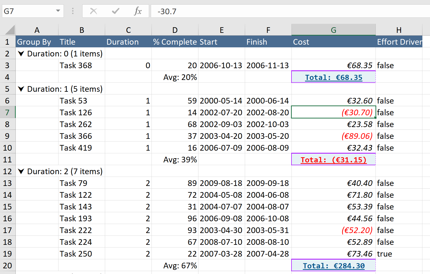
Custom Cell Styling

You can customize the cell styling via excelExportOptions and groupTotalsExcelExportOptions

Please note the following

  • custom stylings & formats are applied on the entire column (not by cell).

  • custom stylings will override any format that might have been detected by the system

  • adding more custom stylings can impact file download time (especially on large dataset)

    • in other words, it is recommended to only customize styling/format on the most important columns

How does it work?

Internally, the lib will detect the correct Excel cell format for each column, it will do this only once per column and keep a reference of the Excel format it found for each column field. For every other rows afterward, it will reapply the previously saved format reference.

Demo with Excel Custom Styling

ViewModel

const columnDefinitions = [
  {
    id: 'cost', name: 'Cost', field: 'cost', width: 80,
    type: 'number',
    formatter: Formatters.currency,
    groupTotalsFormatter: GroupTotalFormatters.sumTotalsCurrency,
    params: { displayNegativeNumberWithParentheses: true, currencyPrefix: '€', groupFormatterCurrencyPrefix: '€', minDecimal: 2, maxDecimal: 4, groupFormatterPrefix: '<b>Total</b>: ' },
    excelExportOptions: {
      style: {
        font: { outline: true, italic: true },
        format: '€0.00##;[Red](€0.00##)',
      },
      width: 18
    },
    groupTotalsExcelExportOptions: {
      style: {
        alignment: { horizontal: 'center' },
        font: { bold: true, color: 'FF005289', underline: 'single', fontName: 'Consolas', size: 10 },
        fill: { type: 'pattern', patternType: 'solid', fgColor: 'FFE6F2F6' },
        border: {
          top: { color: 'FFa500ff', style: 'thick', },
          left: { color: 'FFa500ff', style: 'medium', },
          right: { color: 'FFa500ff', style: 'dotted', },
          bottom: { color: 'FFa500ff', style: 'double', },
        },
        format: '"Total: "€0.00##;[Red]"Total: "(€0.00##)'
      },
    },
  }
];

const gridOptions = {
  enableGrouping: true,
  enableExcelExport: true,
  excelExportOptions: {
    filename: 'my-export',
    sanitizeDataExport: true,
    exportWithExcelFormat: true,
    columnHeaderStyle: {
      font: { color: 'FFFFFFFF' },
      fill: { type: 'pattern', patternType: 'solid', fgColor: 'FF4a6c91' }
    }
  },
  externalResources: [new ExcelExportService()],
};

Export Preview

Below is a preview of the previous customizations shown above

Cell Format Auto-Detect Disable

requires v3.2.0 or higher

The system will auto-detect the Excel format to use for Date and Number field types, if for some reason you wish to disable it then you provide the excel export options below

// via column
const columnDefinitions = [
  {
    id: 'cost', name: 'Cost', field: 'cost', type: 'number'
    excelExportOptions: { autoDetectCellFormat: false }
  }
];

// OR via grid options (column option always win)
const gridOptions = {
  // ...
  excelExportOptions: { autoDetectCellFormat: false }
};

Cell Value Parser

This is not recommended but if you have no other ways, you can also provide a valueParserCallback callback function to override what the system detected. This callback function is available for both excelExportOptions (regular cells) and groupTotalsExcelExportOptions (grouping total cells)

Note the original implementation of both valueParserCallback had separate arguments but that expanded into way too many arguments than original planned and so I decided to merge them into a single args which includes base arguments (columnDef, gridOptions, excelFormatId, stylesheet, dataRowIdx, and depending on the type you will also have dataContext for regular cell OR groupType for grouping cell)

const columnDefinitions = [
  {
    id: 'cost', name: 'Cost', field: 'cost', width: 80,
    type: 'number',
    formatter: Formatters.currency,
    groupTotalsFormatter: GroupTotalFormatters.sumTotalsCurrency,
    params: { displayNegativeNumberWithParentheses: true, currencyPrefix: '€', groupFormatterCurrencyPrefix: '€', minDecimal: 2, maxDecimal: 4, groupFormatterPrefix: '<b>Total</b>: ' },
    excelExportOptions: {
      // for version <=5.1
      // valueParserCallback: (data, col, excelFormatId, excelStylesheet) => {

      // new args signature requires version >=5.1
      valueParserCallback: (data, { columnDef, excelFormatId, stylesheet }) => {
        // when returned as string, it will skip Excel style format
        return `Total: ${data}`;

        // to keep Excel style format, you can use detected "excelFormatId" OR use "excelStylesheet.createFormat()"
        return {
          value: isNaN(data as number) ? data : +data,
          metadata: { style: excelFormatId } // the excelFormatId was created internally from the custom format
        };
      }
    },
    groupTotalsExcelExportOptions: {
      // for version <=5.1
      // valueParserCallback: (totals, columnDef) => {

      // new args signature requires version >=5.1
      valueParserCallback: (totals, { columnDef, groupType }) => {
        const fieldName = columnDef.field;
        return totals[groupType][fieldName];
      },
    }
  }
];
const columnDefinitions = [
  {
    id: 'cost', name: 'Cost', field: 'cost', width: 80,
    type: 'number',

    // use Formatters in the UI
    formatter: Formatters.dollar,
    groupTotalsFormatter: GroupTotalFormatters.sumTotalsDollar,

    // but use the parser callback to customize our Excel export by using Excel Formulas
    excelExportOptions: {
      // you can also style the Excel cells (note again that HTML color "#" is escaped as "FF" prefix)
      style: {
        font: { bold: true, color: 'FF215073' },
        format: '$0.00', // currency dollar format
      },
      width: 12,
      valueParserCallback: (_data, { columnDef, excelFormatId, dataRowIdx, dataContext }) => {
        // assuming that we want to calculate: (Price * Qty) => Sub-Total
        const colOffset = !isDataGrouped ? 1 : 0; // col offset of 1x because we skipped 1st column OR 0 offset if we use a Group because the Group column replaces the skip
        const rowOffset = 3; // row offset of 3x because: 1x Title, 1x Headers and Excel row starts at 1 => 3
        const priceIdx = reactGridRef.current?.slickGrid?.getColumnIndex('price') || 0;
        const qtyIdx = reactGridRef.current?.slickGrid?.getColumnIndex('qty') || 0;
        const taxesIdx = reactGridRef.current?.slickGrid?.getColumnIndex('taxes') || 0;

        // the code below calculates Excel column position dynamically, technically Price is at "B" and Qty is "C"
        // Note: if you know the Excel column (A, B, C, ...) then portion of the code below could be skipped (the code below is fully dynamic)
        const excelPriceCol = `${String.fromCharCode('A'.charCodeAt(0) + priceIdx - colOffset)}${dataRowIdx + rowOffset}`;
        const excelQtyCol = `${String.fromCharCode('A'.charCodeAt(0) + qtyIdx - colOffset)}${dataRowIdx + rowOffset}`;
        const excelTaxesCol = `${String.fromCharCode('A'.charCodeAt(0) + taxesIdx - colOffset)}${dataRowIdx + rowOffset}`;

        // `value` is our Excel cells to calculat (e.g.: "B4*C4")
        // metadata `type` has to be set to "formula" and the `style` is what we defined in `excelExportOptions.style` which is `excelFormatId` in the callback arg

        let excelVal = '';
        switch (columnDef.id) {
          case 'subTotal':
            excelVal = `${excelPriceCol}*${excelQtyCol}`; // like "C4*D4"
            break;
          case 'taxes':
            excelVal = (dataContext.taxable)
              ? `${excelPriceCol}*${excelQtyCol}*${taxRate / 100}`
              : '';
            break;
          case 'total':
            excelVal = `(${excelPriceCol}*${excelQtyCol})+${excelTaxesCol}`;
            break;
        }

        // use "formula" as "metadata", the "style" is a formatter id that comes from any custom "style" defined outside of our callback
        return { value: excelVal, metadata: { type: 'formula', style: excelFormatId } };
      }
    },
  }
];

use Excel Formulas to calculate Totals by using other dataContext props

Inside the column definition there are couple of flags you can set in excelExportOptions in your Grid Options. You can also see the in case the following list is not up to date.

NOTE now deprecated, please use instead

By default the header titles (first row) will be styled as Bold text, however you can choose to style them differently with custom styles as shown below. To find out what styling you can use, you can take a look at Excel Builder-Vanilla website. The code shown below is used in if you wish to see the result.

You can optionally add a custom header title, you can see the UI Sample below, (that will be shown on the first row of the Excel file) through the customExcelHeader callback method. We use the library Excel-Builder-Vanilla to create the export. Visit their website for more info.

If you have lots of data, you might want to show a spinner telling the user that something is happening. You can use the subscribe to the event onBeforeExportToExcel to start your spinner and then onAfterExportToExcel to stop the spinner once the process is done. You can see a this demo which has this feature enabled.

image

see all custom stylings & formats available in

/

image

By using valueParserCallback, there a lot of extra customizations that you can do with it. You could even use Excel Formula to do calculation even based on other fields on your item data context, the code below is calculating Sub-Total and Total. It's a lot of code but it shows the real power customization that exist. If you want to go with even more customization, the new even shows you how to summarize Groups with Excel Formulas (but be warned, it does take a fair amount of code and logic to implement by yourself)

image
excelExportOption.interface
Documentation
Example 24
Documentation
Grouping Example
excelExportOption.interface.ts
Demo page
Demo Component
Example 36
Wiki - Export to File
Demo Page
Demo Component
Grid Options
Column Definition & Options
Custom Column Width
Custom Cell Styling
Cell Value Parser
Cell Format Auto-Detect Disable
Styling the Header Titles
Provide Custom Header Title
Export from Button Click
Show Loading Process Spinner
UI Sample
Custom Cell Styling