📘
Slickgrid-React
Live DemoGitHub
  • Introduction
  • Getting Started
    • Quick start
  • Styling
    • Dark Mode
    • Styling CSS/SASS/Themes
  • Column Functionalities
    • Cell Menu (Action Menu)
    • Editors
      • Autocomplete
      • new Date Picker (vanilla-calendar)
      • LongText (textarea)
      • Select Dropdown Editor (single/multiple)
    • Filters
      • Autocomplete
      • Input Filter (default)
      • Select Filter (dropdown)
      • Compound Filters
      • Range Filters
      • Custom Filter
      • Styling Filled Filters
      • Single Search Filter
    • Formatters
    • Sorting
  • Events
    • Available events
    • On Events
  • Slick Grid/DataView Objects
    • Slick Grid/DataView Objects
  • Grid Functionalities
    • Auto-Resize / Resizer Service
    • Resize by Cell Content
    • Column Picker
    • Composite Editor Modal
    • Custom Tooltip
    • Add, Update or Highlight a Datagrid Item
    • Dynamically Add CSS Classes to Item Rows
    • Column & Row Spanning
    • Context Menu
    • Custom Footer
    • Excel Copy Buffer Plugin
    • Export to Excel
    • Export to File (csv/txt)
    • Grid Menu
    • Grid State & Presets
    • Grouping & Aggregators
    • Header & Footer Slots
    • Header Menu & Header Buttons
    • Infinite Scroll
    • Pinning (frozen) of Columns/Rows
    • Providing data to the grid
    • Row Detail
    • Row Selection
    • Tree Data Grid
    • Row Based Editing Plugin
  • Developer Guides
    • CSP Compliance
  • Localization
    • with I18N
    • with Custom Locales
  • Backend Services
    • Custom Backend Service
    • OData
    • GraphQL
      • JSON Result Structure
      • Filtering Schema
      • Pagination Schema
      • Sorting Schema
  • Testing
    • Testing Patterns
  • Migrations
    • Migration Guide to 3.x (2023-05-29)
    • Migration Guide to 4.x (2023-12-15)
    • Migration Guide to 5.x (2024-05-10)
    • Versions 6 to 8 are skipped...
    • Migration Guide to 9.x (2025-05-10)
Powered by GitBook
On this page
  • Alignment
  • Tooltip Types
Edit on GitHub
  1. Grid Functionalities

Custom Tooltip

PreviousComposite Editor ModalNextAdd, Update or Highlight a Datagrid Item

Last updated 3 days ago

index

  • Tooltip Type

    • with formatter

    • (Async API call from Promise/Observable)

    • with headerFormatter

    • with headerRowFormatter

  • customTooltip options

    • too many to list, consult the interface for all possible options

Description

A plugin to add Custom Tooltip when hovering a cell, it subscribes to the cell onMouseEnter and onMouseLeave events. The customTooltip is defined in the Column Definition OR Grid Options (the first found will have priority over the second) To specify a tooltip when hovering a cell

NOTE: this is an opt-in plugin, you must import the necessary plugin from @slickgrid-universal/custom-tooltip-plugin and instantiate it in your grid options via externalResources, see multiple examples below.

Demo

via Column Definition

You can set or change option of an individual column definition custom tooltip.

import { SlickCustomTooltip } from '@slickgrid-universal/custom-tooltip-plugin';

const Example: React.FC = () => {
  const [dataset, setDataset] = useState<any[]>([]);
  const [columns, setColumns] = useState<Column[]>([]);
  const [options, setOptions] = useState<GridOption | undefined>(undefined);

  useEffect(() => defineGrid(), []);

  function defineGrid() {
    const columnDefinitions = [{
        id: "title", name: "Title", field: "title", formatter: titleFormatter,
        customTooltip: {
          formatter: tooltipTaskFormatter,
          // ...
        }
    }];

    // make sure to register the plugin in your grid options
    const gridOptions = {
      externalResources: [new SlickCustomTooltip()],
    };
  }
}

via Grid Options

You can set certain options for the entire grid, for example if you set exportWithFormatter it will evaluate the Formatter (when exist) output to export each cell. The Grid Menu also has the "Export to Excel" enabled by default.

import { SlickCustomTooltip } from '@slickgrid-universal/custom-tooltip-plugin';

const Example: React.FC = () => {
  const [dataset, setDataset] = useState<any[]>([]);
  const [columns, setColumns] = useState<Column[]>([]);
  const [options, setOptions] = useState<GridOption | undefined>(undefined);

  useEffect(() => defineGrid(), []);

  function defineGrid() {
    const gridOptions = {
      externalResources: [new SlickCustomTooltip()],
      customTooltip: {
        formatter: tooltipTaskFormatter,

        // optionally skip tooltip on some of the column(s) (like 1st column when using row selection)
        usabilityOverride: (args) => (args.cell !== 0 && args?.column?.id !== 'action'), // disable on 1st and also "action" column
      },
    };
  }
}

Alignment

The default alignment is "auto" (which will align to the left by default or on the right when there's not enough room). You can change the alignment on any of the cell (or all of them via grid option) by simply providing a value to the position.

The available position are: 'auto' | 'top' | 'bottom' | 'left-align' | 'right-align' | 'center' (note that "center" was only added recently)

// define your custom tooltip in a Column Definition OR Grid Options
customTooltip: {
  position: 'left-align'
},

Tooltip Types

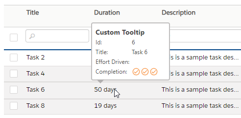
Cell Custom Tooltip with formatter

// define your custom tooltip in a Column Definition OR Grid Options
customTooltip: {
  formatter: tooltipFormatter,
},
const tooltipFormatter: Formatter = (row, cell, value, column, dataContext, grid) => {
  const tooltipTitle = 'Custom Tooltip';
  const effortDrivenHtml = Formatters.checkmarkMaterial(row, cell, dataContext.effortDriven, column, dataContext, grid);

  return `<div class="header-tooltip-title">${tooltipTitle}</div>
  <div class="tooltip-2cols-row"><div>Id:</div> <div>${dataContext.id}</div></div>
  <div class="tooltip-2cols-row"><div>Title:</div> <div>${dataContext.title}</div></div>
  <div class="tooltip-2cols-row"><div>Effort Driven:</div> <div>${effortDrivenHtml}</div></div>
  <div class="tooltip-2cols-row"><div>Completion:</div> <div>${dataContext.percentComplete}</div></div>`;
}

Cell Async Custom Tooltip with formatter and asyncPostFormatter (Async API call)

You can create an Async Custom Tooltip which is a delayed tooltip (for example when you call an API to fetch some info), will show up when hovering a cell it will require a bit more setup. The formatter will be use to show any form of "loading..." and your final tooltip will be shown via the asyncPostFormatter both formatters use the same structure as a regular formatter and accepts html string. It will also require you to provide an asyncProcess of your API call (it could be a Promise or Observable), it also provides the same arguments as a regular formatter.

// define your custom tooltip in a Column Definition OR Grid Options
customTooltip: {
  // 1- loading formatter
  formatter: () => `loading...</div>`,

  // 2- post process formatter
  asyncProcess: (row, cell, val, column, dataContext) => fetch(`/user/${dataContext.id}`), // could be a Promise/Observable
  asyncPostFormatter: userFullDetailAsyncFormatter,
},

here's the final post process async formatter

const userFullDetailAsyncFormatter: Formatter = (row, cell, value, column, dataContext, grid) => {
  const tooltipTitle = 'User Detail - Async Tooltip';
  return `<div class="header-tooltip-title">${tooltipTitle}</div>
  <div class="tooltip-2cols-row"><div>Id:</div> <div>${dataContext.id}</div></div>
  <div class="tooltip-2cols-row"><div>First Name:</div> <div>${dataContext.firstName}</div></div>
  <div class="tooltip-2cols-row"><div>Last Name:</div> <div>${dataContext.lastName}</div></div>
  <div class="tooltip-2cols-row"><div>Age:</div> <div>${dataContext.age}</div></div>
  <div class="tooltip-2cols-row"><div>Gender:</div> <div>${dataContext.gender}</div></div>
  <div class="tooltip-2cols-row"><div>Title:</div> <div>${dataContext.title}</div></div>
  <div class="tooltip-2cols-row"><div>Seniority:</div> <div>${dataContext.seniority}</div></div>`;
}

Column Header Custom Tooltip with headerFormatter

// define your custom tooltip in a Column Definition OR Grid Options
customTooltip: {
  headerFormatter,
},

here's a simple formatter

const headerFormatter: Formatter = (row, cell, value, column) => {
  const tooltipTitle = 'Custom Tooltip - Header';
  return `<div class="header-tooltip-title">${tooltipTitle}</div>
  <div class="tooltip-2cols-row"><div>Column:</div> <div>${column.name}</div></div>`;
}

Column Header Custom Tooltip with headerRowFormatter

// define your custom tooltip in a Column Definition OR Grid Options
customTooltip: {
  headerRowFormatter,
},

here's a simple formatter

const headerRowFormatter: Formatter = (row, cell, value, column) => {
  const tooltipTitle = 'Custom Tooltip - Header Row (filter)';
  return `<div class="headerrow-tooltip-title">${tooltipTitle}</div>
  <div class="tooltip-2cols-row"><div>Column:</div> <div>${column.field}</div></div>`;
}

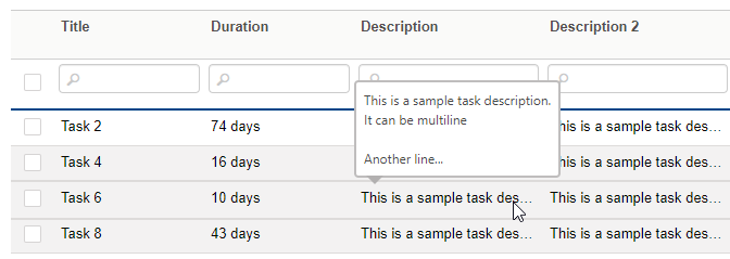
Regular Tooltip with a [title] attribute

You can create a regular tooltip simply by enabling useRegularTooltip: true, it will parse the regular cell formatter in search for a title="..." attribute (it won't work without a cell formatter, unless the cell text content is larger than the cell width when ellipsis shows up "some text..." and that will automatically create a tooltip, that could however be disabled if you wish).

NOTE: regular tooltip, as opposed to other type of custom tooltip, will be rendered as plain text. You could however change that by enabling this flag renderRegularTooltipAsHtml: true

// define your custom tooltip in a Column Definition OR Grid Options
customTooltip: {
  useRegularTooltip: true, // a regular tooltip will search for a "title" attribute in the cell formatter (it won't work without a cell formatter)

  // if you wish to disable auto-tooltip creation when ellipsis (...) shows up, can use this flag
  // useRegularTooltipFromFormatterOnly: true,
},

Regular tooltip max length

By default the custom tooltip text will be limited, and potentially truncated, to 650 characters in order to keep the tooltip with a size that is not too large. You could change the grid option setting with this

const gridOptions = {
  customTooltip: {
    tooltipTextMaxLength: 650,
  },
}

How to delay the opening of a tooltip?

delay a Tooltip with Formatter

There are no built-in option to delay a custom tooltip because it would add too much code complexity to the codebase, however you can simply do that by taking advantage of the Async Custom Tooltip. The only thing you might want to do though is to have the first custom tooltip formatter to return an empty string (so it won't show a loading tooltip) and then use the asyncPostFormatter for the tooltip (note that it will not read the cell formatter, if you have requirement for that then simply combined formatter into an external formatter function, see 2nd examples below).

// define your custom tooltip in a Column Definition OR Grid Options
customTooltip: {
  // 1- loading formatter
  formatter: () => ``, // return empty so it won't show any pre-tooltip

  // 2- delay the opening by a simple Promise and `setTimeout`
  asyncProcess: () => new Promise(resolve => {
    setTimeout(() => resolve({}), 500); // delayed by half a second
  }),
  asyncPostFormatter: userFullDetailAsyncFormatter,
},

delay a Regular Tooltip

It is possible to also delay a regular tooltip (when using useRegularTooltip) even when using the optional useRegularTooltipFromFormatterOnly but it requires a bit of code change. For example, let say you want to parse the title from a formatter but delay it, you could do it as shown below but please note that it will read the asyncPostFormatter, not the cell formatter, and so you should probably create an external formatter function to make simpler code.

tooltip text output will be: "show this tooltip title text"

// define your custom tooltip in a Column Definition OR Grid Options
const columnDefinitions = [{
  id: 'firstName', field: 'firstName', name: 'First Name',
  customTooltip: {
    // 1- loading formatter
    formatter: () => ``, // return empty so it won't show any pre-tooltip

    // 2- delay the opening by a simple Promise and `setTimeout`
    asyncProcess: () => new Promise(resolve => setTimeout(() => resolve(null), 500)), // delayed by half a second
    asyncPostFormatter: `<span title="show this tooltip title text">cell value</span>`, // this will be read as tooltip
  },
  formatter: `<span title="another tooltip title text">cell value</span>`, // this won't be read as tooltip
}];

the previous code could be refactored to have only 1 common formatter that is referenced in both cell formatter and tooltip asyncPostFormatter

tooltip text output will be: "show this tooltip title text"

const myFormatter = () => `<span title="show this tooltip title text">cell value</span>`;

// define your custom tooltip in a Column Definition OR Grid Options
const columnDefinitions = [{
  id: 'firstName', field: 'firstName', name: 'First Name',
  customTooltip: {
    // 1- loading formatter
    formatter: () => ``, // return empty so it won't show any pre-tooltip

    // 2- delay the opening by a simple Promise and `setTimeout`
    asyncProcess: () => new Promise(resolve => setTimeout(() => resolve(null), 500)), // delayed by half a second
    asyncPostFormatter: myFormatter
  },
  formatter: myFormatter
}];

UI Sample

The Export to Excel handles all characters quite well, from Latin, to Unicode and even Unicorn emoji, it all works on all browsers (Chrome, Firefox, even IE11, I don't have access to older versions). Here's a demo

auto tooltip on large text, that is when ellipsis (...) shows up on large text

Async Custom Tooltip (API call Promise/Observable)

/

You can create a Custom Tooltip which will show up when hovering a cell by simply providing a formatter (per column) OR (all columns of the grid), the formatter is the same structure as a regular formatter and accepts html string.

here's a simple formatter (you can see the result in the gif below)

You can create a Custom Tooltip which will show up when hovering a column header (title) by simply providing a headerFormatter (per column) OR (all columns of the grid), the formatter is the same structure as a regular formatter and accepts html string.

You can create a Custom Tooltip which will show up when hovering a column header (title) by simply providing a headerRowFormatter (per column) OR (all columns of the grid), the formatter is the same structure as a regular formatter and accepts html string.

This feature is very useful so you probably want to enable this flag globally, but you could also still choose to add only (per column) OR (all columns of the grid).

image
image
ganSbcmm8v
Demo Page
Demo Component
CustomTooltipOption
Column Definition - Custom Tooltip
Grid Options - Custom Tooltip
Alignment
on Cell
on Cell Async Tooltip
on Column Header (title)
on Column Header row (filter)
with regular [title] attribute
tooltip text length
How to delay the opening of a tooltip?
delay a tooltip with Formatter
delay a Regular Tooltip
UI Sample
via a Column Definition
via Grid Options
UI Sample
via a Column Definition
via Grid Options
via a Column Definition
via Grid Options
via a Column Definition
via Grid Options