Custom Tooltip
index
Tooltip Type
on Cell with
formatteron Cell Async Tooltip (Async API call from Promise/Observable)
on Column Header (title) with
headerFormatteron Column Header row (filter) with
headerRowFormatterNested/Inner Tooltips (parent and child element tooltips)
customTooltipoptionstoo many to list, consult the CustomTooltipOption interface for all possible options
Description
A plugin to add Custom Tooltip when hovering a cell, it subscribes to the cell onMouseEnter and onMouseLeave events. The customTooltip is defined in the Column Definition OR Grid Options (the first found will have priority over the second) To specify a tooltip when hovering a cell
NOTE: this is an opt-in plugin, you must import the necessary plugin from @slickgrid-universal/custom-tooltip-plugin and instantiate it in your grid options via externalResources, see multiple examples below.
Demo
via Column Definition
You can set or change option of an individual column definition custom tooltip.
via Grid Options
You can set certain options for the entire grid, for example if you set exportWithFormatter it will evaluate the Formatter (when exist) output to export each cell. The Grid Menu also has the "Export to Excel" enabled by default.
Alignment
The default alignment is "auto" (which will align to the left by default or on the right when there's not enough room). You can change the alignment on any of the cell (or all of them via grid option) by simply providing a value to the position.
The available position are: 'auto' | 'top' | 'bottom' | 'left-align' | 'right-align' | 'center' (note that "center" was only added recently)
Tooltip Types
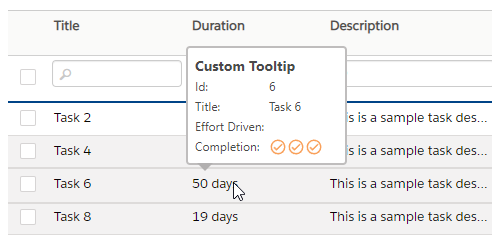
Cell Custom Tooltip with formatter
formatterYou can create a Custom Tooltip which will show up when hovering a cell by simply providing a formatter via a Column Definition (per column) OR via Grid Options (all columns of the grid), the formatter is the same structure as a regular formatter and accepts html string.
here's a simple formatter (you can see the result in the UI Sample gif below)
Cell Async Custom Tooltip with formatter and asyncPostFormatter (Async API call)
formatter and asyncPostFormatter (Async API call)You can create an Async Custom Tooltip which is a delayed tooltip (for example when you call an API to fetch some info), will show up when hovering a cell it will require a bit more setup. The formatter will be use to show any form of "loading..." and your final tooltip will be shown via the asyncPostFormatter both formatters use the same structure as a regular formatter and accepts html string. It will also require you to provide an asyncProcess of your API call (it could be a Promise or Observable), it also provides the same arguments as a regular formatter.
here's the final post process async formatter
Column Header Custom Tooltip with headerFormatter
headerFormatterYou can create a Custom Tooltip which will show up when hovering a column header (title) by simply providing a headerFormatter via a Column Definition (per column) OR via Grid Options (all columns of the grid), the formatter is the same structure as a regular formatter and accepts html string.
here's a simple formatter
Column Header Custom Tooltip with headerRowFormatter
headerRowFormatterYou can create a Custom Tooltip which will show up when hovering a column header (title) by simply providing a headerRowFormatter via a Column Definition (per column) OR via Grid Options (all columns of the grid), the formatter is the same structure as a regular formatter and accepts html string.
here's a simple formatter
Regular Tooltip with a [title] attribute
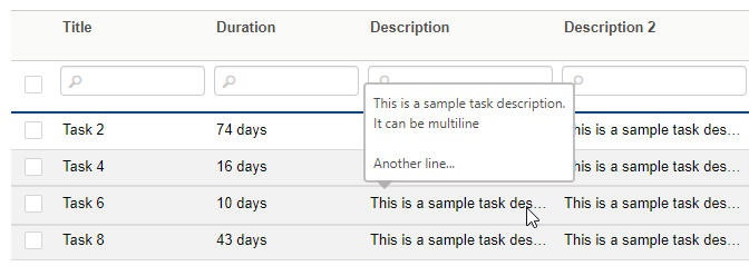
[title] attributeYou can create a regular tooltip simply by enabling useRegularTooltip: true, it will parse the regular cell formatter in search for a title="..." attribute (it won't work without a cell formatter, unless the cell text content is larger than the cell width when ellipsis shows up "some text..." and that will automatically create a tooltip, that could however be disabled if you wish).
This feature is very useful so you probably want to enable this flag globally, but you could also still choose to add only via a Column Definition (per column) OR via Grid Options (all columns of the grid).
NOTE: regular tooltip, as opposed to other type of custom tooltip, will be rendered as plain text. You could however change that by enabling this flag renderRegularTooltipAsHtml: true
Nested/Inner Tooltips
You can have tooltips on both parent and child elements (for example, a button with an icon inside where both have different tooltips). When hovering:
Parent element (button): shows the parent tooltip
Child element (icon): shows the child tooltip
Both tooltips can be styled independently using the CSS data-target-id attribute. This is useful when you want different tooltip styling for nested elements.
HTML Example
Regular tooltip max length
By default the custom tooltip text will be limited, and potentially truncated, to 650 characters in order to keep the tooltip with a size that is not too large. You could change the grid option setting with this
How to delay the opening of a tooltip?
delay a Tooltip with Formatter
There are no built-in option to delay a custom tooltip because it would add too much code complexity to the codebase, however you can simply do that by taking advantage of the Async Custom Tooltip. The only thing you might want to do though is to have the first custom tooltip formatter to return an empty string (so it won't show a loading tooltip) and then use the asyncPostFormatter for the tooltip (note that it will not read the cell formatter, if you have requirement for that then simply combined formatter into an external formatter function, see 2nd examples below).
delay a Regular Tooltip
It is possible to also delay a regular tooltip (when using useRegularTooltip) even when using the optional useRegularTooltipFromFormatterOnly but it requires a bit of code change. For example, let say you want to parse the title from a formatter but delay it, you could do it as shown below but please note that it will read the asyncPostFormatter, not the cell formatter, and so you should probably create an external formatter function to make simpler code.
tooltip text output will be: "show this tooltip title text"
the previous code could be refactored to have only 1 common formatter that is referenced in both cell formatter and tooltip asyncPostFormatter
tooltip text output will be: "show this tooltip title text"
Tooltips Outside the Grid
You can use the custom tooltip plugin to display tooltips on elements outside the grid (e.g., menu items, buttons, dialogs, etc.) by enabling the observeAllTooltips option. This allows the plugin to observe elements anywhere in your page that have title or data-slick-tooltip attributes.
Enable Global Tooltip Observation
Observe Specific Container(s)
If you want to limit tooltip observation to specific container(s), use the observeTooltipContainer option:
You can also observe multiple containers by providing a comma-separated string:
Using Tooltips on External Elements
Once enabled, you can use regular title attributes or data-slick-tooltip on any element:
The styling and positioning will be consistent with your grid tooltips.
UI Sample
The Export to Excel handles all characters quite well, from Latin, to Unicode and even Unicorn emoji, it all works on all browsers (Chrome, Firefox, even IE11, I don't have access to older versions). Here's a demo

auto tooltip on large text, that is when ellipsis (...) shows up on large text

Async Custom Tooltip (API call Promise/Observable)

Last updated